Sunday, April 19, 2009
Fractured Cats
Our most recent assignment for my computer graphic class uses Adobe Illustrator to trace silhouettes and mix them with shapes. These images are then "fractured" and each shape is filled in. This reminds me of Katie Pasquini Masopust's "Ghost Layers and Color Washes" except without making templates of each shape, sorting fabric by hue and value, sewing and quilting. (About a gazillion times the amount of work.)
Using the same design, I developed four colorways. There is also a choice of whether or not to have outlines for the shape like stained glass. In the version shown here, the outlines were removed. And as always, the printed version is never as brilliant as the screen version.
Meanwhile on the home front, I saw my first hummingbird of the year this morning. I have had a feeder up since April 15, the earliest date anyone has seen a hummingbird in this area. I went out on the porch and heard the familiar buzz as the hummingbird shot past me. I put out a second feeder on the opposite side of the porch. The early birds tend to be more feisty. Later on in the season the mothers and babies will be more willing to sit and share the same feeder. And at that point I will have five feeders that I will be refilling daily.
Saturday, April 4, 2009
Learning Illustrator
I went to class on Monday and took pictures of the printer that I turned into a tree planter for a sculpture project. I had wondered if absence would make my heart grow fonder toward it. Nope. Seeing it again confirmed that it was awful. It looks like crafting with a glue gun gone wrong. I realize that not everything works out. And I have plenty of evidence of that. But this is so bad I am not going to show it here. Moving on...
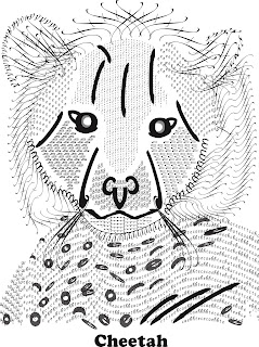
Meanwhile, I am continuing to learn Adobe Illustrator. Our assignment is to take a picture of an animal and recreate it using fonts...basically learning the type tools. You start by placing a picture as a bottom layer and then lay areas and paths of text on top. At a certain point, the font animal takes on a life of its own and the photograph is no longer relevant. In fact, you really have to let go of the original and respond to the new design that is created by the letters. It's like coming up with a really good sentence. You might hold on to it longer than you should and then by a very late draft realize that you just have to let the sentence go because it no longer fits. The version shown here was rasterized--meaning put into a bitmap in Photoshop elements--so I could put it in a format that Blogger would appreciate. And yes, I did think of completing the assignment using the infamous photo of Jimmy. And I'm still thinking about it.
Subscribe to:
Posts (Atom)